Posts

Showing posts from February, 2018

e-Communication Project 1

Image
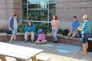
Brainstorming with a teacher and the group e-Communication Project 1                                       Alanna Howard In the first two weeks of e-Communication we were working on a group project. The assignment was to pick one symbol per person and put them all together into a design. We all worked hard to create a well executed image. The finished project Four of us chose animals and the last person chose an object. The four animals were extremely different in shape, size, and habitat. One symbol was a rope, which referred to leadership. Another person's was a dolphin that stood for the love and care for children. I chose a pegasus that means mental activeness. There was a person who picked a song bird to stand for their love of music. The last girl's was a rhinoceros that stood for competitive behavior and somebody you would not want to get on the bad side of. We decided to use our different symbols to create a very symbolic expression. It was decide

Wizard of Oz Poster

Image
Oz Poster Contrast:      My attempt at contrasting with size, color, and font turned out fairly well in my opinion. With the fairly dark background I decided to use a light colors for the text so it could stand out against the page. When dealing with size I made the word "OZ" as large as possible. This was because "OZ" is a very iconic word for this story and it's the word in the title that has the most interest and gets the idea across the quickest. I made "WIZARD" slightly smaller because it was the second most important word in the title. I used mostly two fonts that looked fairly similar in order to cause just enough contrast between the title and the information to be noticeable but not to the point where it was distracting. Everything dealing with contrast was done in moderation to make it pleasing to the eye but still stand out. Alignment:      The main idea is in the title thus it went right in the middle as the center of everything. E