Posts

Showing posts from January, 2018

Font Study

Image
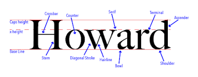
Font Study Project Overview For this project we were assigned to write our first and/or our last name in a serif font. We were told to label 13 items. Three of those being the caps height, the x-height, and the base line. The other 10 were labels of certain parts that can be seen in a font. Overall it was a simple enough project to complete and fairly enjoyable. What I learned about typography During the lessons and project I discovered a large amount of information on the vast subject of typefaces. While a large portion of the lessons were over typing and how fonts are made. The rest of the lessons were devoted to a different topic: Comic Sans. We watched a few videos on why people hate Comic Sans or how it shouldn't be used. Our teacher also told us a lot on how it was made for an old version of a Microsoft browsing assistant. It was made in a couple days for a rush job and was supposed to be based off of the script fonts used in comic books. Also when Microsoft u

Color Wheel

Image
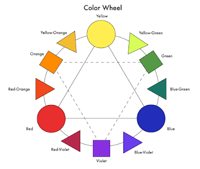
Project      For this graphic design project we made a color wheel for this project. It teaching us the basics of Adobe Illustrator and the importance of color in graphic design. In my opinion it was an easy project. This might just be because I've already had experience in art programs. The colors and the setup of the color wheel were also easy for me since I have a good knowledge of color in art and how to use it. Projects will get harder considering I'm only a freshman in the beginner course. Learning      I learned how to work some of the basics of Illustrator. I'm certain it's a complicated program once you get into detail. Honestly, all we did on this was just make shapes, move them, label them and change their colors. At least I learned how to do those tasks. It should come in handy later on in the course.  Performance      In my opinion I did fairly well. I wouldn't call it amazing or incredible mostly because I was just following instru

Logo Color Schemes

Image
Logo Color Schemes Analogous This logo uses the analogous colors of green, yellow-green and yellow. I think the company probably chose these colors because green and yellow cause peace and comfort for the viewer so a bank would want the viewer to have trust in their bank. This logo uses the analogous colors of blue, blue-green  and green. I think the company probably chose these colors because as a company for upcoming entrepreneurs colors that are considered "modern" and "21st century colors" would attract those with new futuristic and bold ideas. Complementary This logo uses the complementary colors of orange and blue. I think the company probably chose these colors because they would pop out on a desktop and contrasting colors done in this way can cause the viewer to feel the browser is modern and sophisticated. This logo uses the complementary colors of green and red. I think the company probably chose these colors because