Designing a Logo
Logo Design
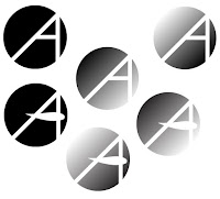
Logo design is an interesting field. Personally, logo design does not come very natural to me, but that might just be due to the fact that I just started. I'm certain that with practice this would become easier. All things considered I think the logo did look pretty good, for my first "professionally done" logo. Coming up with ideas for this was interesting because I had to choose simplistic over complicated all while attempting to get a message across. Many of the complicated sketches gave off the wrong idea most of the time and none looked very appealing. In the end I went with a simple design of an A in the form of a right triangle during sketching.
 After sketching on paper I transferred the idea to digital and began experimenting with gradients and strokes. Eventually I deciding to stick to the geometric shapes for the logo. After I was finished with this the logo was changed to color. I wanted a more cool color to convey the idea of being modern and creative. This limited it down to blues, purples, and some slightly warmer greens.
 At this point I realized I needed more detail and contrast so I added an outline to the shape. This led to some major improvement and change in the appearance of the logo. I added it to all the color choices and finally limited it down to one final design once it was added to all the mockups. It's very simplistic yet modern so it gives off the creative feeling that I was going for. Everything turned out very impressive and looking good.


Comments
Post a Comment