Posts

Final Blog

Image
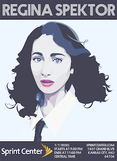
Final Blog For one project, we had to create a poster design, postcard design, and ticket design for a music concert or art show. I picked a music concert of one of my favorite musicians, Regina Spektor. It took me a long time; I believe it was around three weeks of work. I ended up getting behind while working on the vector portrait of her, but I’m proud of how it turned out. It was difficult to catch up and keep up. However, learning how to use adobe better was a good experience. Overall, I like this project, and so did my table partner. I did have to adjust the ticket design due to it being boring with just Regina, so I added the flowers. The poster is my favorite, mostly because you can see the vector graphic the best in that one.   In this project, we had to create a card design for some occasion. For mine, I decided to make a design for my dad’s 50th birthday and for my brother’s high school graduation. It took me a couple weeks, but I was actually ahead ...

Vector Portrait

Image
Vector Portrait Pre-Production: I used a photograph of my lovely bunny, Gunter. It was difficult finding a flattering picture of him, since he's rather camera shy. However, once I found one that I liked and was clear enough, I imported the image, then posterizing the image in photoshop. Gunter was a fun subject, since he's very cute and always seems to have some sort of expression in his body language. Production: It was difficult to work with the pen tool in illustrator, just due to layer errors or the vector lines not turning out exactly how I wanted them. However, I did work out all the issues and learned more about how to use the pen tool. I moved the layers into different body parts and tried to work better with layering the different colors and pieces. I did try to use repetition in the colors, but contrasted the mostly monotone colors of Gunter with the blue background. Post-Production/Final Product: Overall, I do like how this image turned out. That might ...

Typography

Image
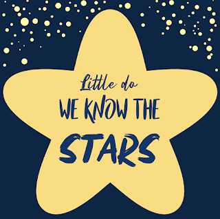
Typography I found quotes fairly easy to find, but picking which quotes to use was difficult. Finding fonts was easy, since I knew which tones I wanted to go for with specific words or messages. Using Illustrator proved to be difficult, but I worked with it and slowly got used to the different tools and functions. I figured out a lot of tool functions during this. Most of my typing was done to be centered or to align with the other words for balance. Color was interesting, and I preferred it more than black and white since the image felt more whole. I like how they turned out, actually. I included screenshots of my favorite black and white ones along with my favorite colored quotes.

Performance Review

Image
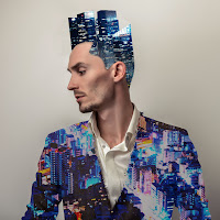
Performance Landscape Man We were assigned to photoshop images over his jacket and shirt to create a "Landscape Man," as it was called. This took around a week of class, but I came in a lot during lunch and after school to get it finished, since I was behind. I had a whole lot of difficulty in remembering how to use different tools of photoshop. With doing that, I had to relearn a lot of photoshop tools, so that was incredibly difficult. After I finished, I did get compliments, mostly due to its difference from most other projects. Most people were using forest scenes or nature, but I couldn't work with that, so I went with a cityscape. I really like this one, actually. It has such bright colors and contrast, so this really appeals to my favorite color palettes. Panorama This project was a panorama of photographs that follow a certain theme. My theme was childhood memories. We spent around two weeks in class, I believe, but I took a while and had to spend time ...

Watercolor Prints

Image
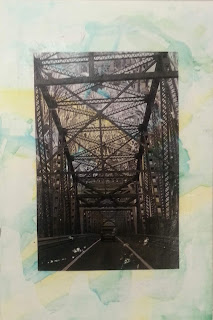
Watercolor Prints      During this process we printed out one photoshop project we completed, making two copies. We also colored pieces of paper with watercolor. After the colored papers were dry, we put mod podge on them in a thick coat. Then we placed the printed projects onto them, flattening it out and removing any excess mod podge with a squeegee. We let them dry, then using water and our fingers to wash off the print paper from the colored paper until it was smooth. Once that was done, they dried again and then we had finished the transfer prints.      I found this to be a nice break from all the photoshop we had been doing in class. It was difficult and confusing, but it was better than photoshop. During the course of this, I struggled with understanding directions, but did my best to follow them. I believe I did well when it came to watercolor, which was something I enjoyed. In my opinion, this has been the best project in graphic design so far...

Printing Processes

Image
Printing Processes Relief Printing It is a printing process where a person carves an image into a block of linoleum or wood. -Tone block with jet black film ink wash or Indian Ink wash. -Transfer drawing onto wood or linoleum block. -Cut image into block. -Roll ink over block. -Set thin piece of paper onto the block. -Apply gentle pressure with a baren to the block evenly. -Check the print, then pull up the piece of paper that now has the print copied onto it. Intaglio Printing This method has the artist carve the image onto a black ground of a metal plate, then use acid to deepen the ruts in the metal. -Prepare plate by polishing and cleaning it. -Apply a ground onto the plate -Smoke the plate on the side with the ground. -Scratch out image on the ground of the plate -Etch the plate by placing it into a form of acid for 15 minutes, which will deepen the scratches on the ground. -Pull out the plate and rinse it. -Put the plate back into the...

Panorama

Image
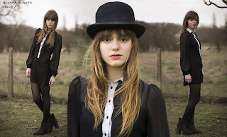
Panorama      Home, my home, to be exact. Many memories are involved with simply the idea of home. The familiar sights of the blue paint in my room, noises of family talking or dogs going in an out into the back yard, or the specific and unique scent every home has. I recognize the sound of each family member's steps as they walk around the house. The sight of quick movement when my rabbit is running around the living room. The noise of dogs wandering around and the clicking their nails against the wood or tile.      In my life, I travel to different family members. I go to my grandmother's house on my mother's side. Her home is always very clean and quiet. My grandmother's house on my father's side is very loud and busy with people. I also visit my cousins in Saint Louis. It is a nice drive there, and they are always friendly. Family has always been key while I was growing up.      There are the experiences of home. Experiences suc...

Pop Art

Image
Pop Art When I started the design, I took several photos of the subject, Ryan Moore, and picked the one that looked the best with posing and content. I liked the comic style and sharp edges of Roy Lichtenstein, so I used them as an inspiration. I also took inspiration from Andy Warhol, with the use of bright colors and contrast. I used a mix of cool colors for the subject, such as blue, green, violet and indigo. The background used warmer colors like light red, yellow, and orange. I used the quick selection tool to get large portions filled in. This saved a lot of time. I changed the opacity of different layers occasionally. While I did the orange outline of the subject, I used the polygonal lasso tool to create that blocky outline, which I found to be a neat and subtle effect. 

The Nature Man

Image
The Nature Man      We were assigned to edit a photo of a man by adding on different scenery pictures to him. I, unfortunately, was gone a day, and basically had my life completely thrown off track. I haven't been able to enjoy the class or keep up with everybody since. By now, I'm just trying to keep getting stuff done, so I can get the grades in, since I'm struggling in this class. Basically, my entire completion of this project has been working in between other projects and coming in during lunch. I went in with an idea, and just went for it, improvising for the most part. I would've spent a longer time carefully planning out a beautiful image, but I couldn't do that with the time I had to work on it. Keep in mind, I have other classes that need me to make up work and continue to give out homework, so stress was already high. Still, I finished the project.      I definitely learned the kind of stress photoshop brings to people who aren't experts in i...

Photoshop Tutorials

Image
Photoshop Tutorials We were assigned to follow tutorials of photoshopping different photographs. It was difficult, but I eventually finished. We simply followed along the tutorials, learning the different aspects and tools of photoshop. I had some troubles along the way, but eventually finished. Once I thought I was finished, I realized my name wasn't on most of the images, so I went back and put my name and hour on. I learned that technology is not your friend, and photoshop is no excuse. It doesn't attempt to make things easier on you. Things will go wrong, and for some odd reason the software will completely change up the image and not let you undo it. It was not an easy or fun experience, to say the least. I kept up with deadlines, luckily, but wasn't enjoying this project whatsoever. If I could go back, I'd avoid any distractions and just get the work done with. However, I still got everything done on time, so keeping everything on time would be good to d...

Creating a Company: Gateway

Image
For this project we were given around nine weeks to invent a company, design a product, create all the graphics and advertisements for it, complete a product website, and present it to our peers. Over the course of the nine weeks our group ran into troubles involving technical issues and the big rush to get everything done near the end. Personally, I’ve discovered that even if you think you’ll have time, you should get things done as soon as you get that time to work on it. Some feedback from our peers was mostly over our presentation. Generally people liked our product and our final presentation was well-received. We had to do a lot of edits and practice our presentation quite a bit in order to perfect it, however. Overall the work did add up and turn out nicely to create and present our product. During class we always divided the work and each worked individually with the review of our other group members to give us opinions and critique. Whenever we finished early we too...

Personality Test

Image
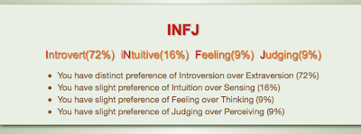
Personality Test INFJ      My personality is INFJ, Introverted, iNtuitive, Feeling, Judging. For the introvert section I like to be alone in order to recharge. Being intuitive means I think of the future more than the present and am able to come up with new ideas. Feeling refers to how I make decisions based on feelings of myself and others over logic and fact. Judging means I try to plan and get details to sort everything out for the future. One person I share personality type with is Martin Van Buren, a previous American president.      This is very accurate to me. Personally I can't be around people for too long without getting stressed and tired. While this doesn't mean I can't communicate or I don't like people, this just means sometimes I just would prefer to be alone. One thing that isn't completely accurate is the feeling portion. I do rely on feelings in many decisions however I do take all the facts into consideration before making any c...